Monday, July 10th, 2017

For Week Ending July 1, 2017

Nationally and locally, economic conditions affecting residential real estate have not changed much this year, which is good for market stability. The most recent jobs report was favorable, while unemployment and mortgage rates both remain satisfyingly reasonable. If there were more homes for sale, we might see a shift in prices. Although builder and seller confidence are high, we are not close to a trend change in that regard.

In the Twin Cities region, for the week ending July 1:

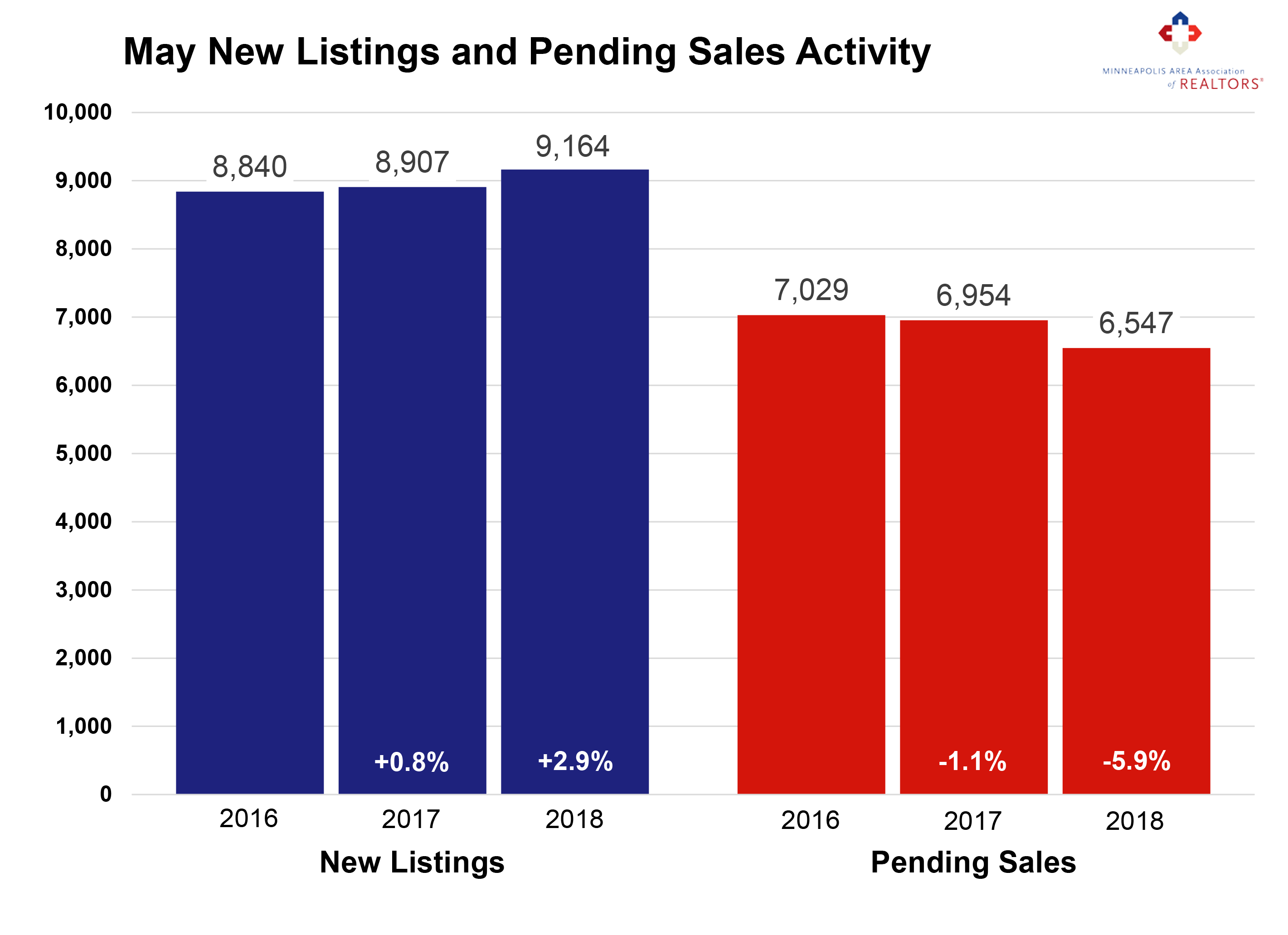
  • New Listings decreased 0.1% to 1,587
  • Pending Sales decreased 5.6% to 1,377
  • Inventory decreased 16.5% to 12,628

For the month of May:

  • Median Sales Price increased 5.5% to $250,000
  • Days on Market decreased 15.0% to 51
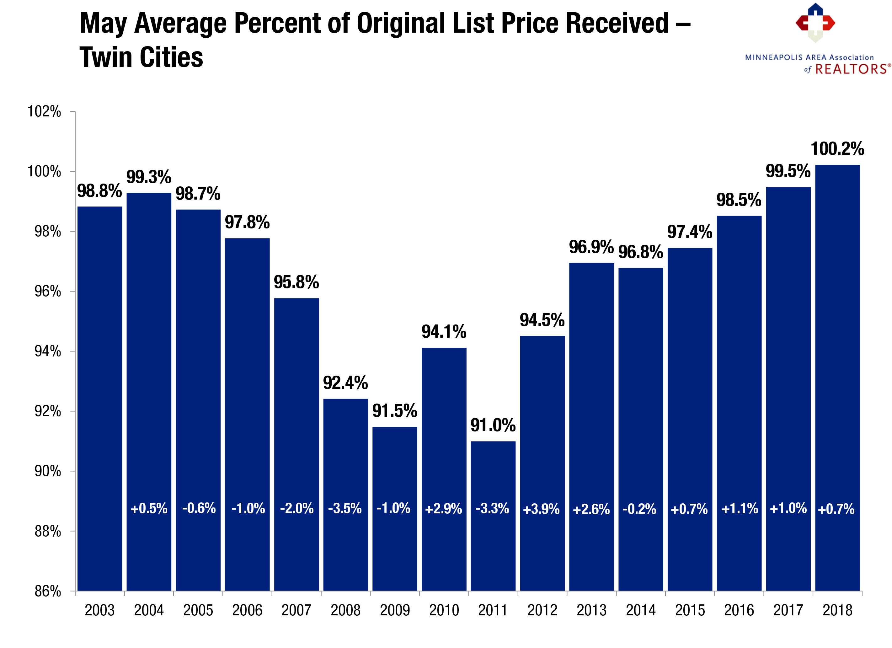
  • Percent of Original List Price Received increased 0.9% to 99.5%
  • Months Supply of Inventory decreased 17.2% to 2.4

All comparisons are to 2016

Click here for the full Weekly Market Activity Report. From The Skinny Blog.

Posted in Weekly Report |
Monday, July 3rd, 2017

For Week Ending June 24, 2017

We are now beyond two years of year-over-year declines in inventory, and it doesn’t look like the situation is going to change anytime soon. However, buyer demand and home prices are still rising, and the number of distressed homes on the market has fallen. It would be great to see more starter homes on the docket for new construction during these next few busy building months to help those that are looking to enter the market.

In the Twin Cities region, for the week ending June 24:

  • New Listings increased 1.2% to 1,928
  • Pending Sales decreased 1.1% to 1,405
  • Inventory decreased 16.3% to 12,481

For the month of May:

  • Median Sales Price increased 5.5% to $250,000
  • Days on Market decreased 15.0% to 51
  • Percent of Original List Price Received increased 0.9% to 99.5%
  • Months Supply of Inventory decreased 17.2% to 2.4

All comparisons are to 2016

Click here for the full Weekly Market Activity Report. From The Skinny Blog.

Posted in Weekly Report |
Monday, June 26th, 2017

For Week Ending June 17, 2017

As Millennials get older and more established in their careers, more of them are
entering the housing market. Nationwide sales rose to the third-highest level since
the housing crisis a decade ago, while home prices also hit record highs. Although
increasing prices may push some out of the running for a home purchase, mortgage
rates remain low enough to lure potential buyers.

In the Twin Cities region, for the week ending June 17:

  • New Listings decreased 6.6% to 1,840
  • Pending Sales decreased 4.8% to 1,396
  • Inventory decreased 16.2% to 12,316

For the month of May:

  • Median Sales Price increased 5.5% to $250,000
  • Days on Market decreased 15.0% to 51
  • Percent of Original List Price Received increased 0.9% to 99.5%
  • Months Supply of Inventory decreased 17.2% to 2.4

All comparisons are to 2016

Click here for the full Weekly Market Activity Report. From The Skinny Blog.

Posted in Weekly Report |
Monday, June 26th, 2017

By David Arbit on Friday, June 23rd, 2017

As the shortage of residential property listings persists, many observers are rightly examining recent new construction trends. We’d like to get in on that.
INV-1-702x511
Using exclusively NorthstarMLS data, this analysis only looks at listings with a “year built” field of 2016 or later. However, the closed sales count only uses 2017YTD activity and inventory is always the most recent monthly snapshot, further limiting the pool of records and keeping the analysis as up-to-date as possible while still allowing for a reasonable sample size of records.

As of the end of May 2017, 25.3% of all active listings that were built in or after 2016 were listed between $400,000 and $500,000. 24.9% of all actives were listed between $300,000 and $400,000. In other words, about half of all recently-built active listings were priced between $300,000 and $500,000. About 33% were priced above $500,000; while the remaining 17% were listed under $300,000.

There are a few noteworthy trends here. There seem to be several threshold effects. First, active listing market share declines dramatically above $500,000 for relatively recent construction and then flattens out somewhat. The next notable decline comes above the $1.3M mark. That may reflect the tear-down activity happening around the metro–particularly within the urban cores and inner-ring suburbs. Even though most of the demand for new construction is well under $1M (more on that below), this could reflect the higher land, tear-down and (re)development costs associated with infill construction. There is also a significant decline above $2.5M, which could reflect a mix of risk aversion from developers and a fairly limited buyer pool.
CS-1-702x514
Transitioning over to the demand side, the $300,000 to $400,000 bracket witnessed the largest share of newly-built home sales. Next up was the $400,000 to $500,000 range, followed by the $200,000 to $300,000 range. Once again, activity drops off above $500,000 and again over $600,000.

Interestingly, and in contrast to active listing share, the $800,000 to $1,000,000 range enjoyed more sales than the $700,000 to $800,000 range. Sales between $1,300,000 and $1,600,000 represented less than half the market share of those between $1,000,000 and $1,300,000. In other words, the “$1,000,000 plus crowd” may be willing to enter the low seven-figures but maybe not yet much beyond that.

The $800,000 to $1,000,000 range also captures listings that sellers and builders initially listed at $1,049,000 or $1,099,000 and had a price adjustment or an offer accepted under the $1,000,000 threshold. Even though a home may have been listed above the $1,000,000 mark, it may have sold for less.
Ratio-1-702x515
That got us thinking: wouldn’t it be cool to look at the ratio of active versus sold market share by price point? Of course it would! So that’s what we did.

Unsurprisingly, for the most part, active market share tends to outweigh sold market share as you climb the price ladder. In other words, the higher the price point, the more likely you are to have more supply relative to demand. That’s why absorption rates and market times increase in the higher brackets. It’s also why the ratio of sold price to list price tends to be slightly lower. There simply isn’t the same market pressure or imbalance between supply and demand in the luxury brackets as there is in the affordable brackets.

As indicated, that theory is mostly supported by this analysis, with a few exceptions. First, the market share of active listings between $2,000,000 and $2,500,000 is about 5 times that of the sold market share in that range (0.54% versus 0.11%). Even though it’s a small sliver of both active and sold market share, it’s that ratio or relationship between the two shares that we’re after. Even the $3,000,000 and up range has a ratio of about 4.5.

Second, and perhaps surprisingly, the ratio of active to sold market share in the $2,500,000 to $3,000,000 range was only about 1.7, lower than all other ranges above $700,000 except $800,000 to $1,000,000. That means the active market share in that range is only about 60-70 percent higher than the sold market share in that range, which seems downright balanced compared to 4 to 5 times greater active versus sold market share in other upper brackets.

Third, and as expected, it’s difficult for builders to be profitable under the $300,000 price point, given rising construction costs, limited lot availability, the labor shortage and new impact fees. Also as expected, budget-conscious consumers facing limited inventory options are having to go farther out where newer construction is more common. The fact that sold market share is outpacing active market share in all ranges up to $400,000 speaks to the strong demand but insufficient building activity in these affordable and in-demand price points.

You see? Data can be educational AND fun! Infosparks and the many market reports on our website can help you impress your next client and increase your referrals and repeat business. Please use the data for good and never for evil!
From The Skinny Blog.

Posted in The Skinny |
Monday, June 26th, 2017

Housing Markets are heating up, prompting concerns of whether or not we are in a bubble. But, another 2008-style collapse is unlikely.

Posted in Monthly Skinny Video |