By David Arbit on Tuesday, August 18th, 2015

“Accept certain inalienable truths: Prices will rise. Politicians will philander. You, too, will get old. And when you do, you’ll fantasize that when you were young, prices were reasonable, politicians were noble and children respected their elders.” – Mary Schmich
We hear a lot about home prices and how they change over time. But by far the biggest pitfall of dealing in absolute dollar terms is that a dollar in 2015 does not buy what a dollar used to get you in 1960 or even in 2010. If you’ve ever purchased the same product or service even just several years apart, you implicitly know this, though you may not be familiar with some of the rationale and technical aspects of tracking and adjusting for inflation. And let’s be clear here: that is ok!
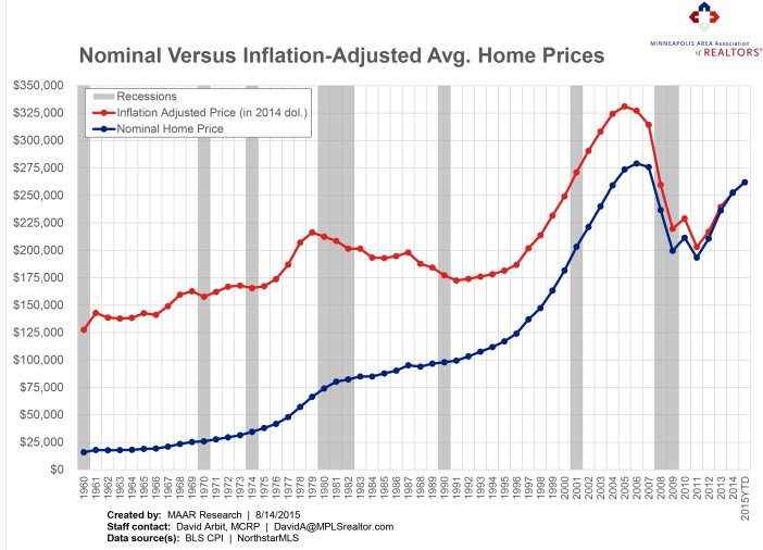
While the nominal (not inflation-adjusted) home price has certainly increased in absolute terms, the typical home that cost $15,977 in 1960 dollars would actually cost exactly $127,635 in 2014 dollars. So a lot of what appears to be price gains is actually attributable to inflation, though not all of it. This is why it’s important to separate out inflation-adjusted prices from nominal, reported prices. It’s the best way to answer the question: excluding the effect of inflation, how much did real home prices actually increase?
The Consumer Price Index (CPI) is the most common method to account for inflation when dealing with time-series data stated in currency units. Using the Bureau of Labor Statistics (BLS) CPI, we’ve adjusted historic home prices and restated them in constant 2014 dollars. Note how far apart the trendlines start versus where they end up. Only when nominal prices approach 2014 do the trendlines converge—since, at that point, both nominal and adjusted prices are stated in 2014 dollars.
Enough with the buildup. So what’s really going on here?
Between 1960 and 2015, nominal home prices increased from $15,977 to $261,963, a gain of 1,539.6 percent. During the same period, inflation-adjusted prices increased from $127,635 to the same $261,963 for a more modest gain of 105.2 percent. That’s a big difference, and shows just how much of the run-up in prices can be attributed to inflation.
But it’s also important to note that home prices more than doubled during the 54 year study period (1960-2014) even after adjusting for inflation and despite the downturn. That means after factoring for inflation, home prices kept pace with inflation AND doubled in 54 years. An increase of 105.2 percent spread out across 54 years translates into a 1.95 percent real annualized average growth rate. That finding supports the roughly 2.0 percent annual home price increase that is referenced quite often. It also supports the fact that real estate is an effective inflation hedge.
Equally or perhaps even more importantly, while nominal home prices are quickly nearing their 2006 highs, inflation-adjusted or real home prices are still well below their previous peak in 2005. In other words, while nominal prices seem to be approaching their previous peak, real home prices are still a bargain, especially compared to 2004-6 prices stated in 2014 dollars. That means real home prices have to increase 26.4 percent before they break even with 2005 levels. Nominal home prices have about 6.6 percent to go before reaching 2006 levels.
But life is all about choices, and choices—at least in the strict economic sense—represent a series of opportunity costs. An opportunity cost of a choice, such as buying a house, is what you give up to get it. Most of us have to choose between two major investments at any given time. Sure, gold and other precious metals might also keep pace with inflation and then some, but you can’t live in a pile of bullion. You can only visit your gold periodically. Investing in a home is one of the most effective inflation hedges out there. Plus, while you’re quietly slaying the inflation dragon and enjoying some appreciation, you’ve got a place to live!
 From The Skinny Blog.